Maker
Category
#Product Design
#Visual Design
#Crypto
About the project
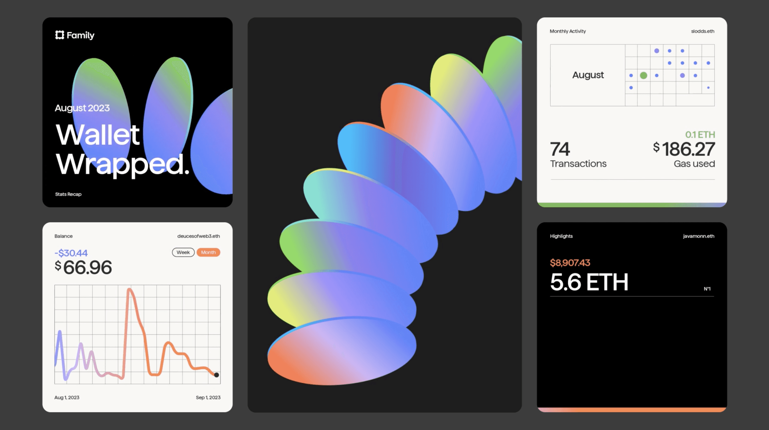
Wallet Wrapped is a monthly campaign where we generate a unique video for every one of the Family users. It’s just like Spotify Wrapped, but for your crypto wallet. Your last 30 days on-chain are summarized in a beautiful unique video, every month. It’s available in Dark & Light mode.
What sparked this project?
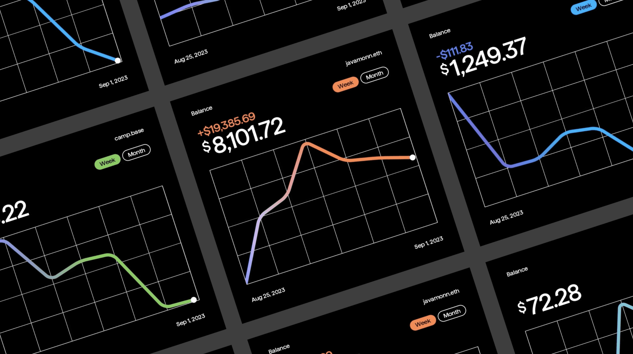
This is the first ever wrapped campaign for us. When Family got in touch we immediately knew we were a perfect fit. Together we finetuned the initial idea into a template made of modules that showcase your crypto holdings, most active day, your latest NFTs, and so on.
Being built in modules, if the corresponding crypto activity is missing, a module gets swapped out to always keep things short & straight to the point.
Our new cloud rendering technology (based on Lottie) and our Algo API allow us to scale video creation to potentially millions of videos per day, enabling these types of personalized campaigns.
Who was on the team for the project?
Algo:
Luca Gonnelli — Co-founder & Creative Director
Camille Pagotto — Art Director & Designer
Matteo Ruffinengo — Lead Animator & Automation Engineer
Nima Farzaneh & Mattia Giordano — Data Science & Web development
Marina Echer Barbieri — Project Manager
Ornella Felizia & Mara Salazzari — Portfolio
Family:
Founder: Benji Taylor
Creative Direction: Alex Vanderzon
Technical Direction: Joseph Smith & Daniel Ramirez
Do you have some project metrics to share?
The setup of the project, including the app integration, took quite a bit of time. Definitely more than the couple of months of our average timeline. The Family team has incredible attention to detail, but was really great to work with.
The first round of videos, which went live on October 1st – and showcases the users’ September activity – included thousands of videos. The whole creation process took less than 50 mins to render on our infrastructure, on a lazy Sunday morning.
What is your approach to working on a project like this? Do you follow a specific process or framework?
In this project, the process was really a continuous, beautiful back & forth with our client. We like to describe a collaboration that works well with the metaphor of dancing together. Each side gives an input and the other continues from there. When this happens, creating together feels like magic.
After selecting the most useful wallet data to be showcased in the recap, the Family team started building their endpoint providing all the data.
At the same time, Camille (from our team) & Alex (from Family) fine tuned the design until we were all satisfied.
Then, our R&D Director, Matteo, worked on the animation in After Effects, created the Lottie template and coded it to make it interact with variable data. In the meantime, our Tech Lead, Nima, built the data connection with Family and set up our Algo API.
Finally, we set up the dedicated cloud infrastructure, added the light mode, did a bunch of tests (and bug fixed the system) and we were ready to go live.
What did the early versions of this project look like? What did you learn from this v1?
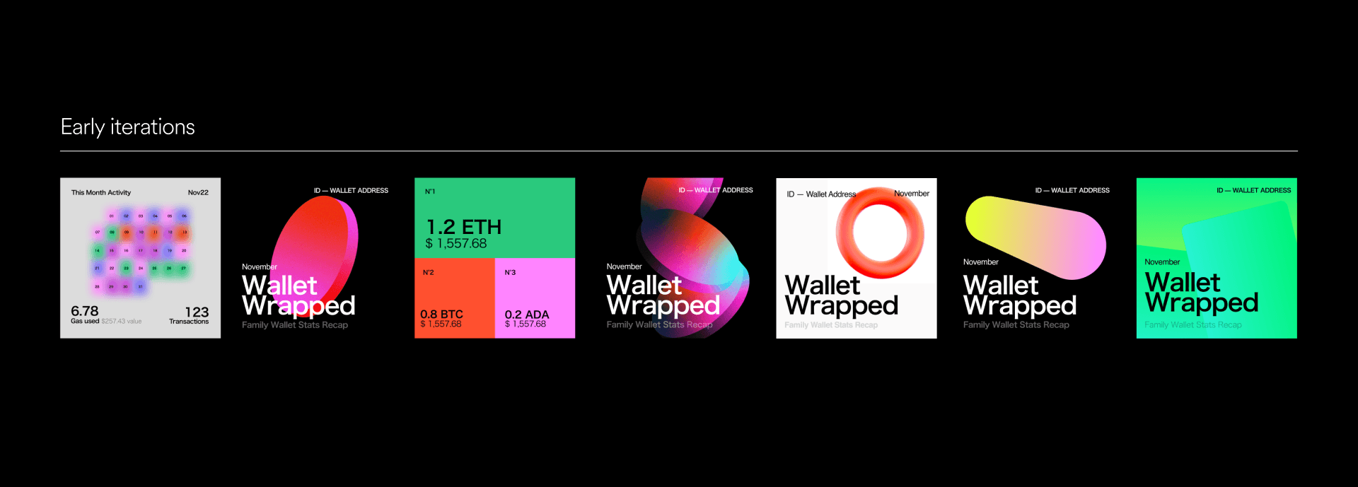
The objective of the project was to find a simple graphical language based on the repetition of a strong visual element on the cover. We tried wallet cards, abstract objects but we found in coins the simplicity we needed and the possible declination on all scenes.
'Our new cloud rendering technology (based on Lottie) and our Algo API allow us to scale video creation to potentially millions of videos per day, enabling these types of personalized campaigns.'
What was the biggest challenge? Did any part of the project make you step out of your comfort zone?
We were a bit in between blurred effects, to represent monthly activity in terms of intensity, and more solid fills to be as precise as possible (we’re talking about money, after all). We finally decided to use gradients inside of solid shapes, which allowed us to talk about intensity, and those gradients came to highlight very light grids. Typography was also a main topic with a very special eye to detail from the client, who provided their own custom typeface.
Iteration: Previous Colors
How did you overcome this challenge?
What and/or who inspired you during the creation of this project?
We were super inspired by heat maps, and scientific language in general. We loved to play with the structure of data, combined with highlights of colors and intense gradients.
Among our references for the project we have:
→ The Road to Interoperability Report
→ The NYT’s Story Portrait campaign, by Droga5, that creates a unique artwork for every NYT subscriber, with gradients changing in function of what topic they read the most.
→ The Apple Pay visual language overall
What was your biggest learning or take-away from creating this project?
We learned many more things about crypto, for sure. Tokens, sends, swaps, mints, gas fees. That kind of stuff. The videos were received incredibly well by the community. We really hope people are going to be more in control of their digital finances thanks to our monthly review.
Our attention to details was mandatory in this project, and this made the difference in the result. We wanted a project we are all proud of, in terms of design, animations, general look and precise structure.
Can you point out a detail in the project that might go unnoticed but you’re particularly proud of?
Most people might not notice that the cover of the videos is generative. If your month was very active you’ll see more coins animating and in warmer colors. And the opposite if the month was less active.
It’s a tiny detail that makes it all more real.
'It’s a tiny detail that makes it all more real.'
Which part of this project consumed the most time or energy?
The most time consuming part was to find a visual system that works in terms of color contrast to represent different activity levels, but that’s also subtle enough to match the Family vibes. We tried different interesting routes and then the art direction naturally evolved towards this balance of grids, clean typography and strong, bold visual elements that give character to the design.
What was the result of this project?
The project has just started, but I love the fact that as Family grows, this project will grow with them. More and more people will receive their Wallet Wrapped every month.
We’re also sure this won’t be the last Wrapped campaign we’re going to build at Algo. We can’t wait to work on the next one.
Where was the project created? What do you enjoy about working there?
The project was created across EU & US time zones. Our team is based in Torino, Italy, with our designer Camille in Marseille, France. Family is in LA (& spread across the US) so collaborating involved a few early morning calls for them — that were late afternoon calls for us. But honestly, we worked mostly asynchronously on Slack.
If this project had a soundtrack, which one would it be?
Which tools did you use to create this project?
Figma — including the new variables, for anything design and collaboration
Illustrator — Design of the Coins and Gradients
Adobe After Effects — for animation & rigging
Lottie — for the Template. We use Lottie to get the animation outside of After Effects.
Our new, serverless, lottie-based Render Farm — for rendering videos in a blast
Algo API — that the Family app uses to trigger the video creation

What are you currently working on, and what's next?
Currently, we’re building a generative system embedded into a mobile app for one of our clients. It’s an AI chatbot that answers questions about the stock markets, by creating videos. Soon in our portfolio.
Who or what are you inspired by lately? Any current influences that you find are seeping into your work
Here’s some of our fav accounts at the moment:
→ Quim Marin Studio
→ Connor Campbell’s Experimental Motion Design
→ Posters & artworks by My name is Wendy
If you could give your younger self one piece of advice about navigating the design world, what would it be?
Give your gut feeling more decision making power.
Your personality is a strength, make people need you.
From the maker


