About the project
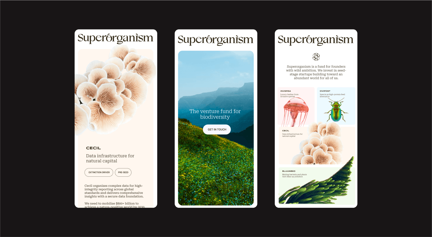
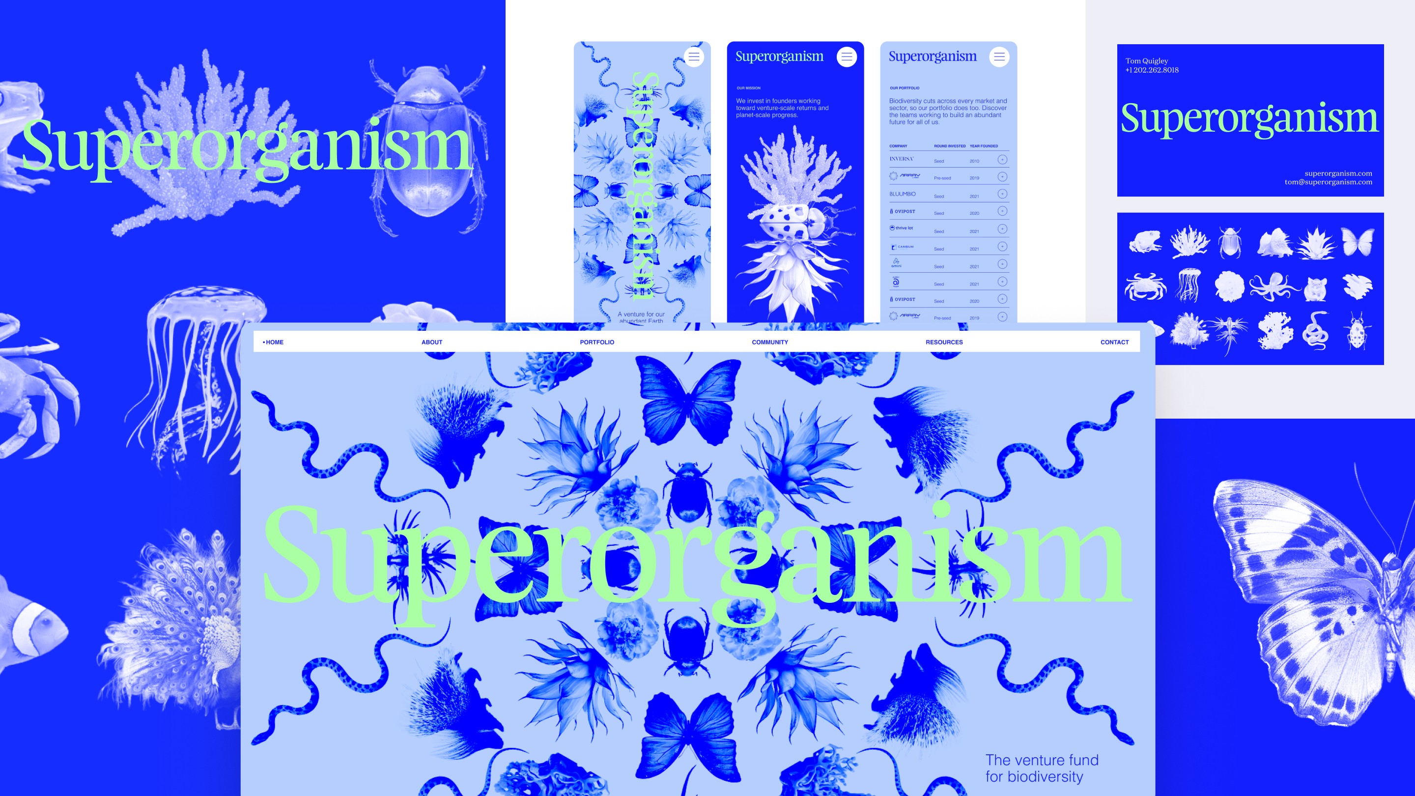
Superorganism is the first venture firm for biodiversity. Superorganism invests in seed-stage startups working to benefit biodiversity while generating venture-scale returns. As they emerged from stealth, Superorganism reached out to Goodside to create a brand identity as unique as they are. Inspired by the wonder of nature and the ambition of their vision, we developed a strategy and identity that did exactly that.
What sparked this project?
Design is a small world, and so is VC—and both are very much driven by word of mouth referrals. Tom and Kevin were referred to us by another VC. While we typically partner up with VCs to brand their portfolio companies, this was our first project branding the firm itself. And it was a very special one. Straight away we were inspired by Superorganism's contagious love for our earth and their desire to really push the brand into unexpected territories.
Who was on the team for the project?
Superorganism is the company. The founders are Tom Quigley and Kevin Webb. They’re a unique pair, with Tom bringing a conservation technology background and Kevin coming from venture capital. Their unique blend of skills makes for an unexpected and disruptive approach in their space—which is exactly what the world needs!
Brand Design and Creative Direction: Jessica Strelioff Brand Strategy and Creative Direction: Danielle LaRoy Website: Hunter Thompson or Kinetic Studio Animation: Stina Wahlén
Do you have some project metrics to share?
We counted it all up, and the project totaled 10 weeks, 13 Zoom calls, 4 rounds of revisions, and 22 logo designs, with a whole lot of collaboration in between.
What is your approach to working on a project like this? Do you follow a specific process or framework?
Our process at Goodside is built on our belief that great brands require great strategy, so every project for us starts with Discovery and Positioning. This is the phase where we establish the foundation for the visual and verbal system that follows. For Superorganism, our discovery process involved interviews with Tom and Kevin, of course, along with conversations with their portfolio companies and LPs. We dove deep into their extensive documentation about their vision and theses—Tom and Kevin are self-proclaimed over-communicators, which was a huge advantage during this process—and conducted a brand workshop to kick the tires on some early ideas.
Lots of research and a look at the landscape around them revealed, unsurprisingly, there’s no one quite like them. From a strategy perspective, understanding Superorganism meant understanding equally the worlds of venture capital and environmentalism. The contrasts between the two disciplines inspired us to play with the concepts of present and future, reality and possibility, “what is” and “what if.” This dynamic tension became the backbone of our story, celebrating Superorganism as the bridge that connects present and future for founders with wild ambition. We wrote an in-depth post about the process behind the Superoganism brand. You can find that here. And our standard project process is outlined on our website here.
What did the early versions of this project look like? What did you learn from this v1?
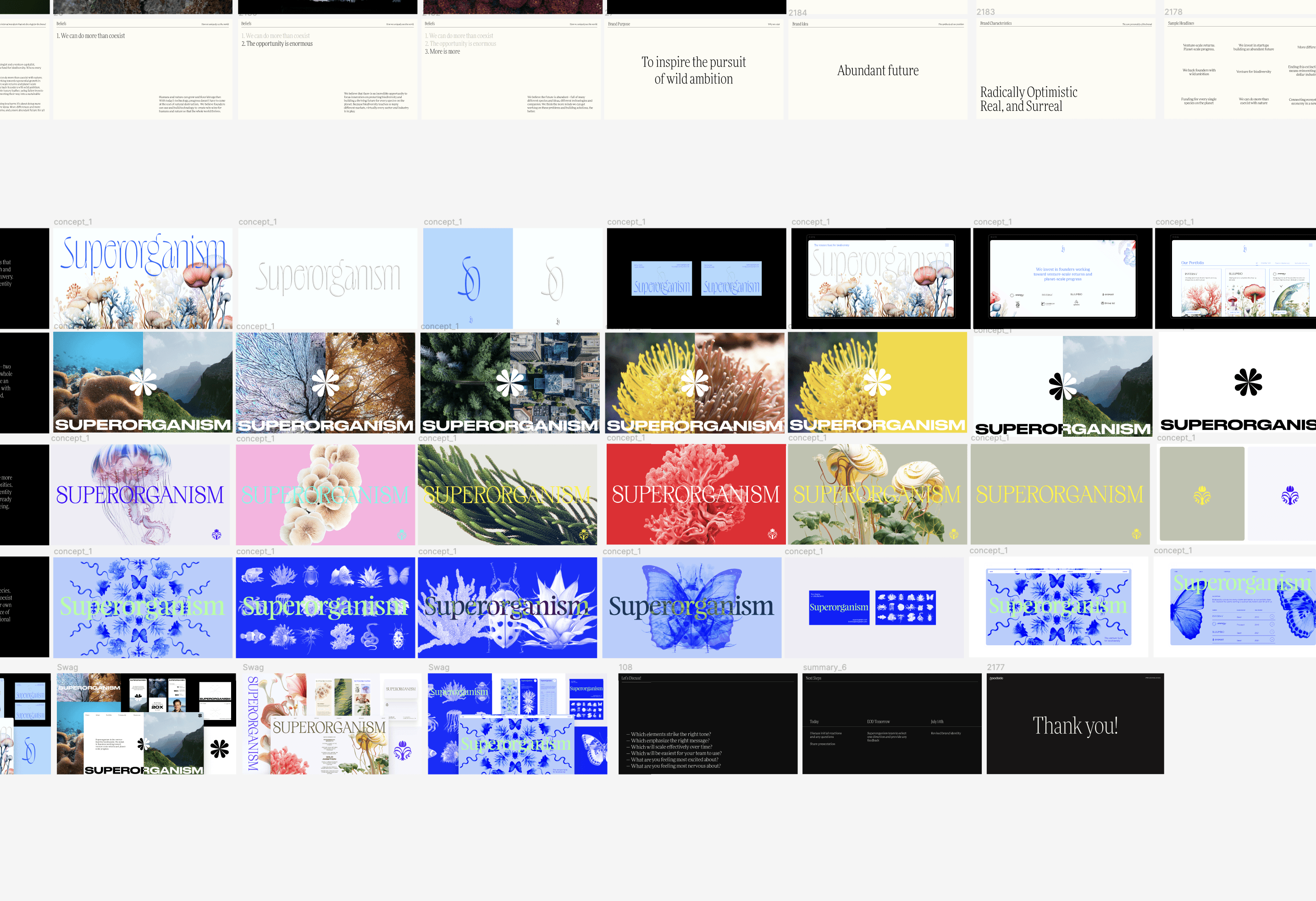
We’ve shared it all in this process post! In V1, we explored a wide range of creative expressions to bring the wonder of biodiversity to the forefront of the brand. One direction was encyclopedia-inspired, another played with the concept of pattern matching as a way to bridge venture and nature. In the end, we all found the cabinet-of-curiosities approach exciting, unexpected, and something worth pursuing in Rounds 2 and 3. Lots more here.
'Straight away we were inspired by Superorganism's contagious love for our earth and their desire to really push the brand into unexpected territories.'
What was the biggest challenge? Did any part of the project make you step out of your comfort zone?
Working with a venture capital firm, we really wanted to convey the possibilities for the future, and we were excited about using AI tools to do it. In Round 1, we developed a few concepts that hinged on using AI quite prominently, but ultimately we all agreed that wasn’t quite right because the future world Superorganism is working toward isn't some surreal place—it's real, it's possible, and it's full of species that are already here and beautiful.
How did you overcome this challenge?
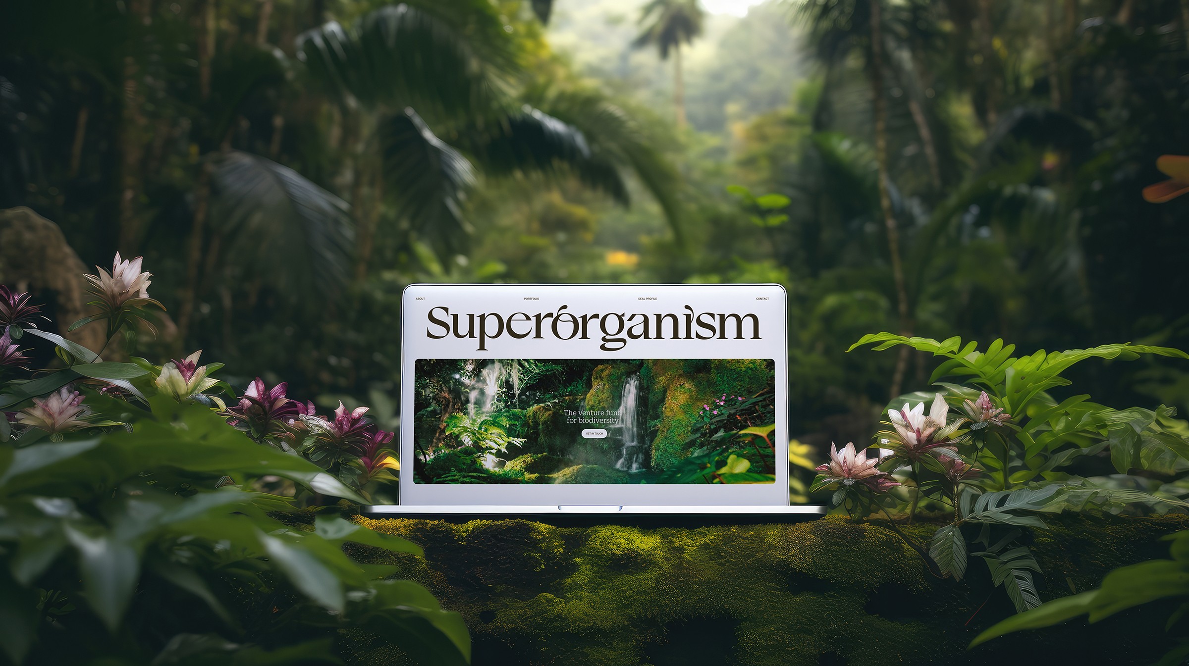
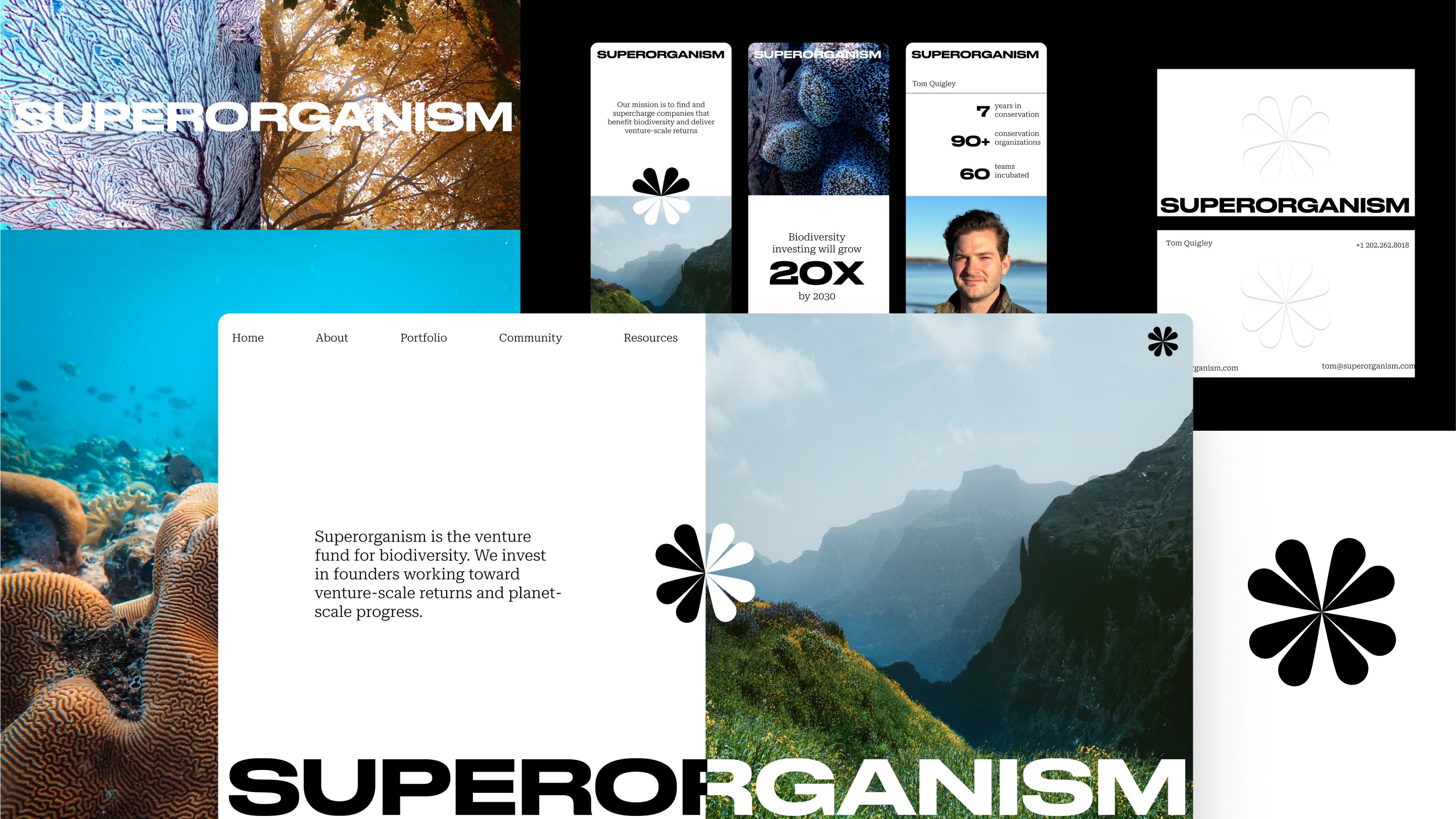
We opted, instead, to highlight the weird and wonderful species in our world with real photography. By bringing you up close and personal with some of the wilder species in our world, the brand reminds viewers that there is so much diversity and abundance here worth protecting. We did end up using AI to generate custom, ultra-lush mockups to showcase the brand, which felt like a fun way to incorporate that forward-looking lens into the project.
What and/or who inspired you during the creation of this project?
Tom and Kevin, the founders of Superorganism, have a contagious energy and love for the planet and species that live on it. We were constantly sharing inspiration back and forth of different plants and animals that we couldn’t believe existed—things from deep in the Amazon or on the ocean floor. The weird, wild, wonderful species on Earth were the ultimate muse for this brand.
What was your biggest learning or take-away from creating this project?
While we've worked on a good number of climate-focused projects in the past, this was the first time we really focused on biodiversity. And we learned a ton! As humans, we benefit from and rely on biodiversity for pretty much everything—every forest, peat bog, coral reef, even open ocean supports humankind in some way. Around 55% of today’s global GDP is heavily or moderately reliant on natural systems, and 2.7 billion humans directly depend on nature for at least one basic need. The urgency of the extinction crisis we are living through cannot be overstated. Up to 25% of all species are at risk of extinction—and ours could be too if we don't act quickly!
Can you point out a detail in the project that might go unnoticed but you’re particularly proud of?
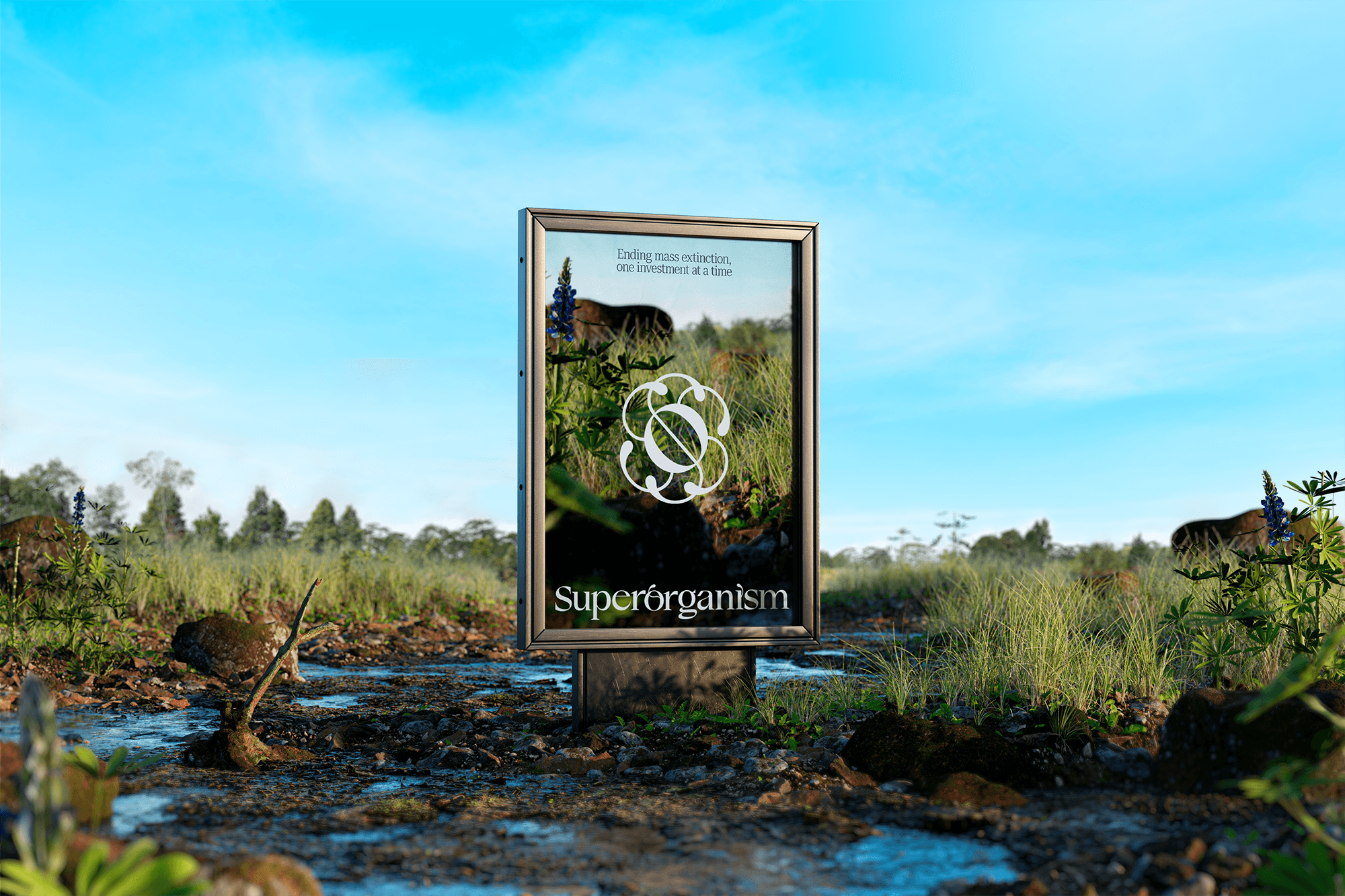
A superorganism is a form of life composed of mutually interdependent parts that maintain various vital processes. Think ant colonies, beehives, coral reefs, etc. The logo is part monogram, part superorganism. For the mark, we took inspiration from corals, a superorganism comprised of polyps (the individual), corals (the community), and reefs (the ecosystem). There are visual similarities and symmetries across every level, from polyp to reef, and some extremely apt metaphors across all levels to what Tom and Kevin were building.
'Try every seat at the table. We both often reflect on how important it was for us to gain experience on the client side, the agency side, and the independent side before starting Goodside.'
Which part of this project consumed the most time or energy?
Getting the logo just right was definitely a challenge and took several rounds to nail. It turns out, finding a single mark that can encompass the whole of nature and the diversity of the Earth's species isn’t easy!
What was the result of this project?
Superorganism’s launch was covered in Bloomberg, Forbes, and TechCrunch, all with really positive press coverage. And the brand was received really well within the design community. We heard lots of kind feedback, and it was particularly rewarding to see so much love for the logo that we worked so hard on. The launch happened just a few months ago, and we've already had multiple referrals from the project!
Where was the project created? What do you enjoy about working there?
Goodside was co-founded by Jessica Strelioff and Danielle LaRoy. Jessica is based in Austin, Texas and leads the visual side of the house (design and art direction); Danielle lives in San Francisco, California and leads the verbal side (brand positioning and copywriting). Most days, our collaboration happens remotely with Figma cursors flying past each other and a never-ending stream of Slack messages. We both love the freedom and flexibility of working from our homes—it’s where we feel the most relaxed and at ease, which leads to the best creative output. That said, we also make a concerted effort to get together at least quarterly to jam in person. There’s something really refreshing about being together that helps us step back from the nuts and bolts of work and think bigger about what we’re building with Goodside.
If this project had a soundtrack, which one would it be?
Which tools did you use to create this project?
-FigJam for brand workshops with the Superorganism team
- Adobe Illustrator for logo design
- Adobe Photoshop for image editing
- Figma for strategy, brand presentation, and system creation
- Adobe After Effects for logo animation
- Webflow for website build
- Midjourney
- Adobe Photoshop for brand case study mockups
What are you currently working on, and what's next?
As a rule of thumb, we only take on two projects at a time. Right now we are working on a rebrand for a home electrification company and a new brand for another (!) VC firm that focuses on AI. In parallel, we’re working on a few Goodside initiatives to extend our impact. We just launched Goodside Gives (https://www.goodside.studio/blogs/announcing-goodside-gives), which is our subsidized and pro-bono project program for people doing a lot of good on a not-so-lot of budget. We’re also ironing out the details of another venture that is still in a more nascent phase—we’re not ready to share details yet, but we’re really excited to get that out soon!
Who or what are you inspired by lately? Any current influences that you find are seeping into your work
If you aren’t feeling inspired by the possibilities of AI yet, consider this your sign to dive in! We’re feeling so energized and excited (and yes, a little scared) by the power of these new tools at our disposal. On the flip side, we’re endlessly inspired by historical and vintage material. Whenever we get a new project, we always start with the history of the industry or problem being solved. From a strategy standpoint, understanding how we got to where we are today is critical context. And on the design side, there’s so much to explore visually in the archives. Austin is full of thrift stores and vintage shops, which makes it an easy city to be inspired in.
If you could give your younger self one piece of advice about navigating the design world, what would it be?
Try every seat at the table. We both often reflect on how important it was for us to gain experience on the client side, the agency side, and the independent side before starting Goodside. Early in our careers, we each worked in-house at tech companies in their hypergrowth stage—Jessica on the brand team at Asana, Danielle in marketing at Dropbox. We learned a lot about the practical side of brand implementation and what it takes to actually use and scale a brand system at a fast-growing company. We gained a lot of empathy for our clients in those roles, and we definitely put that to use in our process. Of course, our years spent at agencies were equally formative—it’s where we met! It’s also where we gained experience building a wide range of brands, experimenting with different styles and ways of working. That gave us the confidence to set out on our own independent journeys, where we learned a ton about how to run a business. As we teamed up, being able to share learnings from each step and bring that fluency to the table with our clients has been huge. We’d highly recommend it for any and all up-and-comers!


