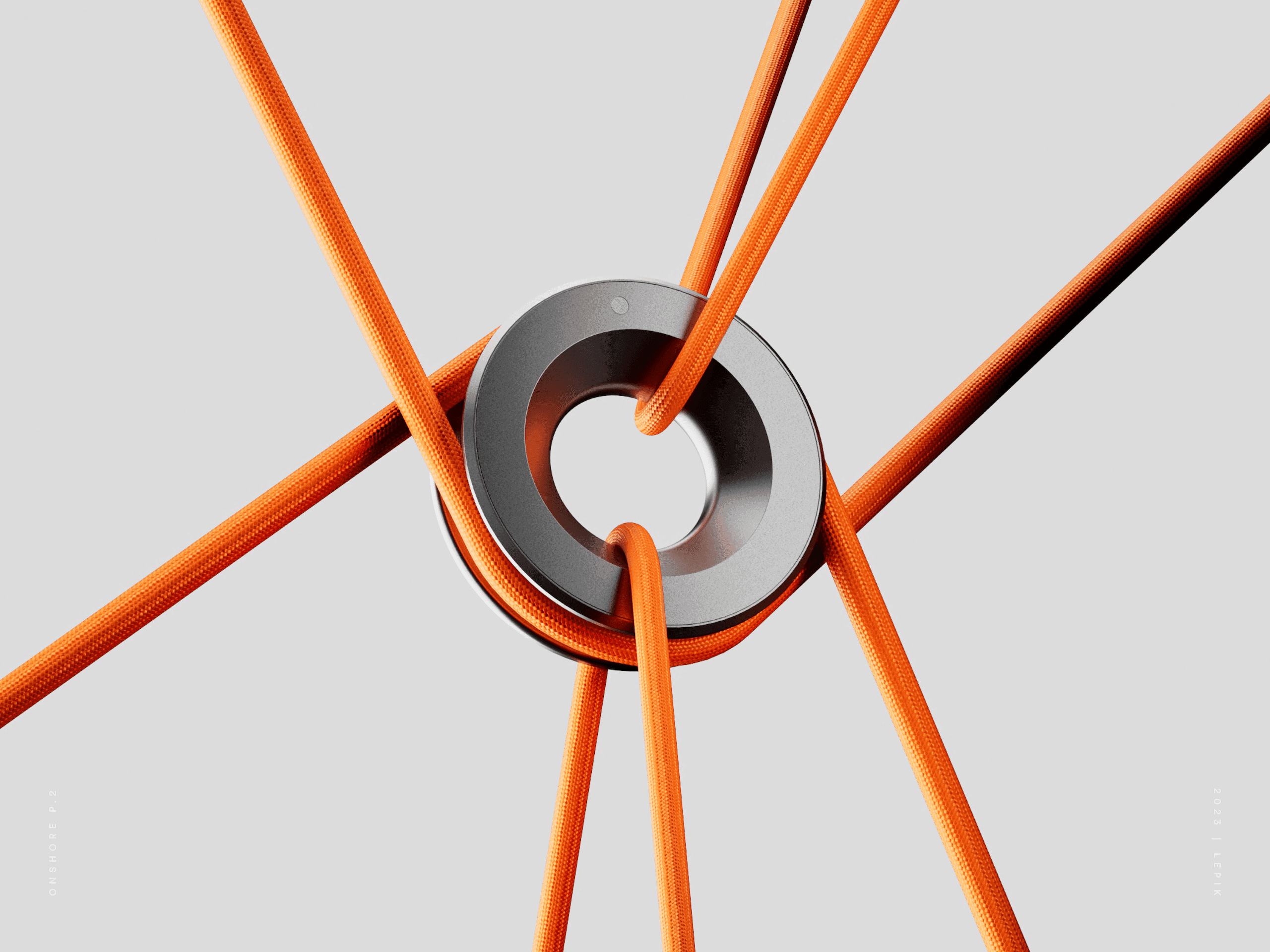
About the project
A spectral color is a color that is evoked by monochromatic light, when viewed as a continuous spectrum, these colors are seen as the familiar rainbow. When I see color, I don't just see a single one, I see the possibilities in it, when I add blue to red in a gradient that make it not just one emotion, they form a whole new color because of the mix of them, which is everything I love, exploring the infinite combinations in hue and looking for colors that have not been seen.
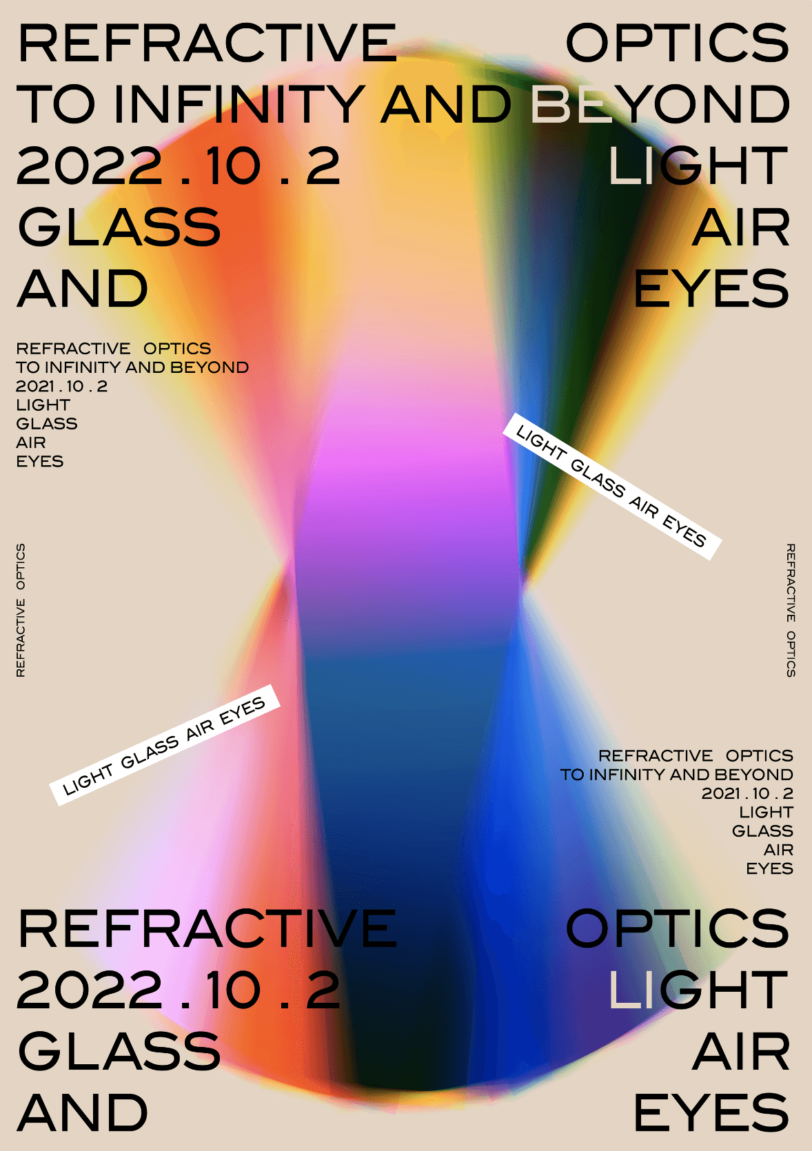
Candy
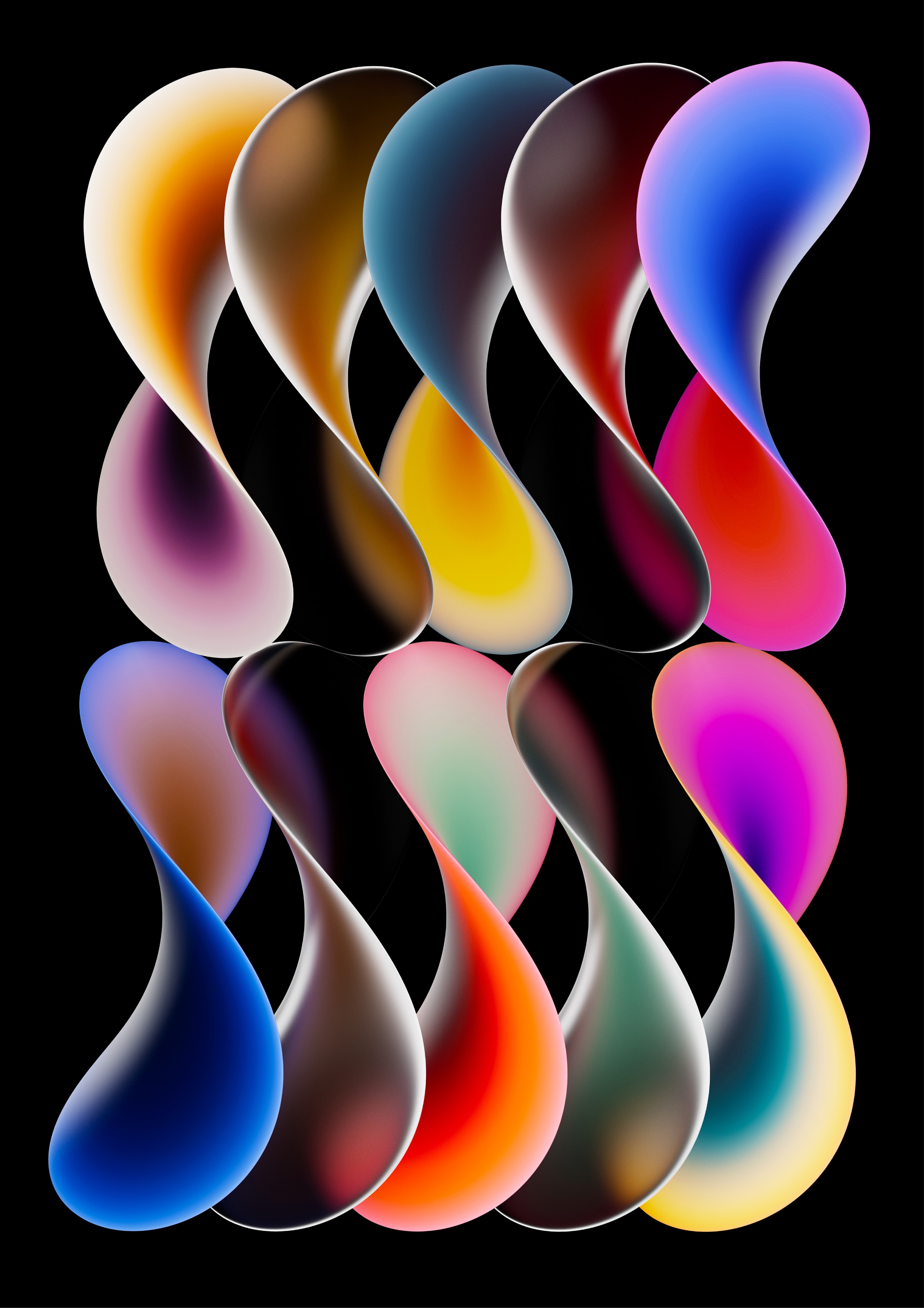
Donut V03
What sparked this project?
After creating numerous visuals, I discovered various ways to present gradients. Once I found that spark, I've been consistently pursuing it ever since.
What is your approach to working on a project like this? Do you follow a specific process or framework?
I usually plan out the concept and production process before starting my creations. I skip sketches and directly dive into the software because it's a faster approach for me. In geometric graphics, color combinations are crucial, so I invest a significant amount of time in selecting colors. After completing the visual, I also create various iterations for comparison. This way, the final presentation of the visual is the most comprehensive.
What did the early versions of this project look like? What did you learn from this v1?
Early in my creative journey, there was a lot of exploration of style, especially in terms of color. Initial designs often leaned towards darker and more chaotic tones. However, it's through these early experiences that I gradually honed my artistic style step by step.
'It's through these early experiences that I gradually honed my artistic style step by step.'
What was the biggest challenge? Did any part of the project make you step out of your comfort zone?
The biggest challenge is striving to surpass each previous visual with every new creation. I aim for each new piece to be better than the last, and this endeavor completely pushes me out of my comfort zone.
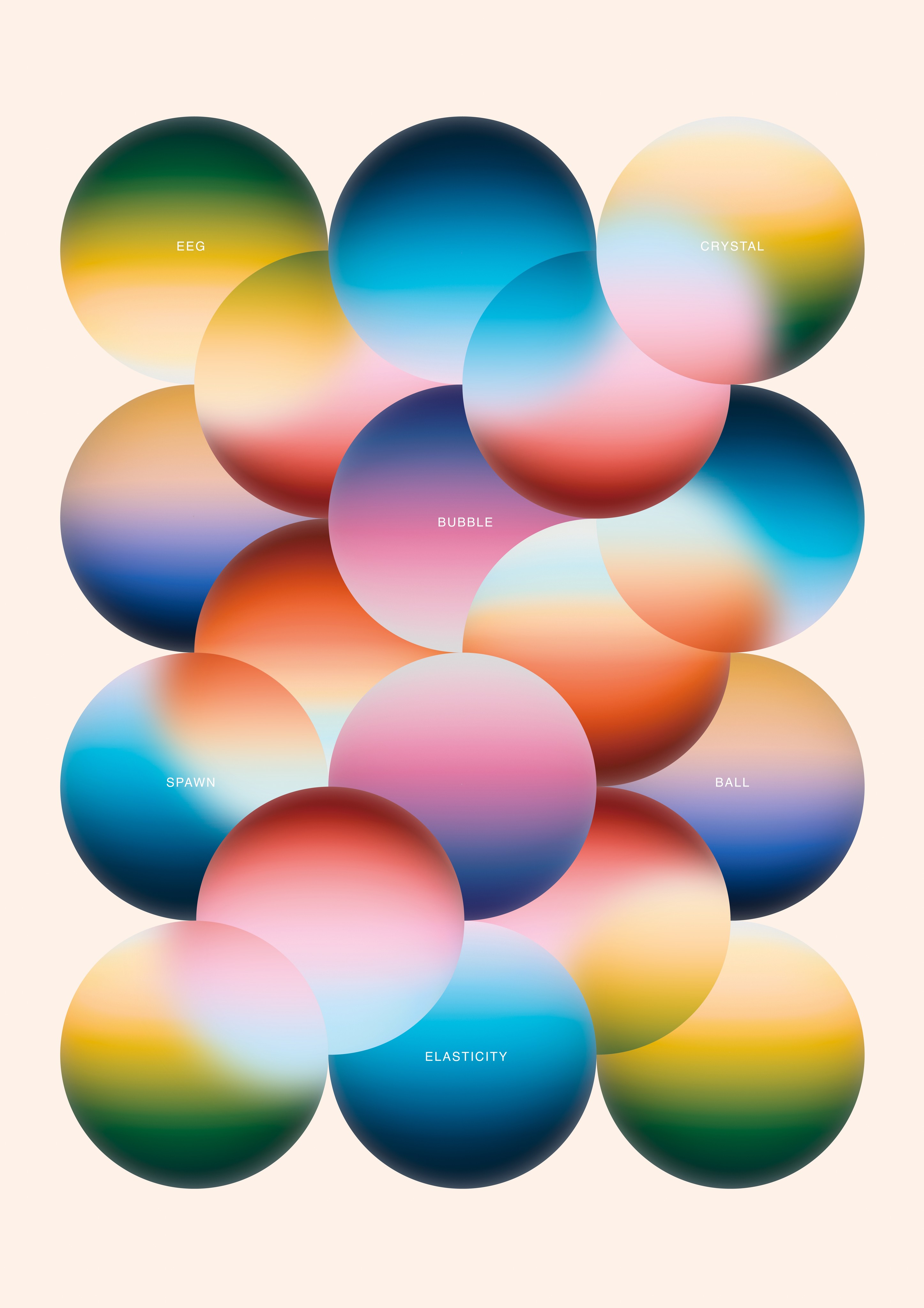
Eggs
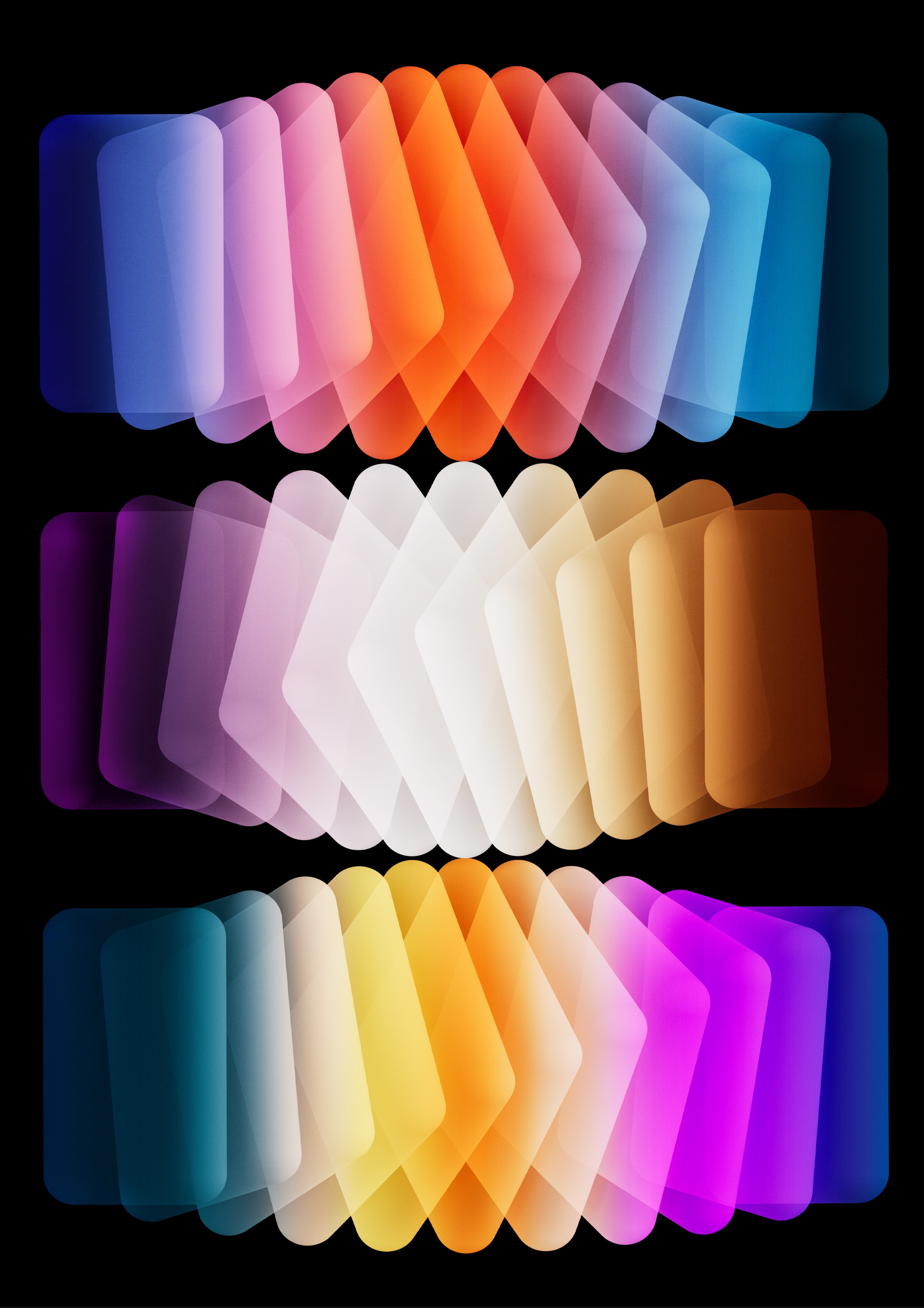
Turning around
How did you overcome this challenge?
Continued creation and improving efficiency.
What and/or who inspired you during the creation of this project?
I believe my greatest inspiration comes from Ólafur Elíasson. His unique perspectives on the colors of light have greatly influenced me.
What was your biggest learning or take-away from creating this project?
I've gained a wealth of technical experience and attracted more clients who appreciate my style.
Can you point out a detail in the project that might go unnoticed but you’re particularly proud of?
Actually, I incorporate a similar color palette in each of my works to maintain a consistent overall aesthetic.
'I believe that color composition greatly influences the visual presentation.'
Which part of this project consumed the most time or energy?
Color mixing takes up the majority of my time, as I consider it to be of utmost importance. I believe that color composition greatly influences the visual presentation.
What was the result of this project?
Unsure
Where was the project created? What do you enjoy about working there?
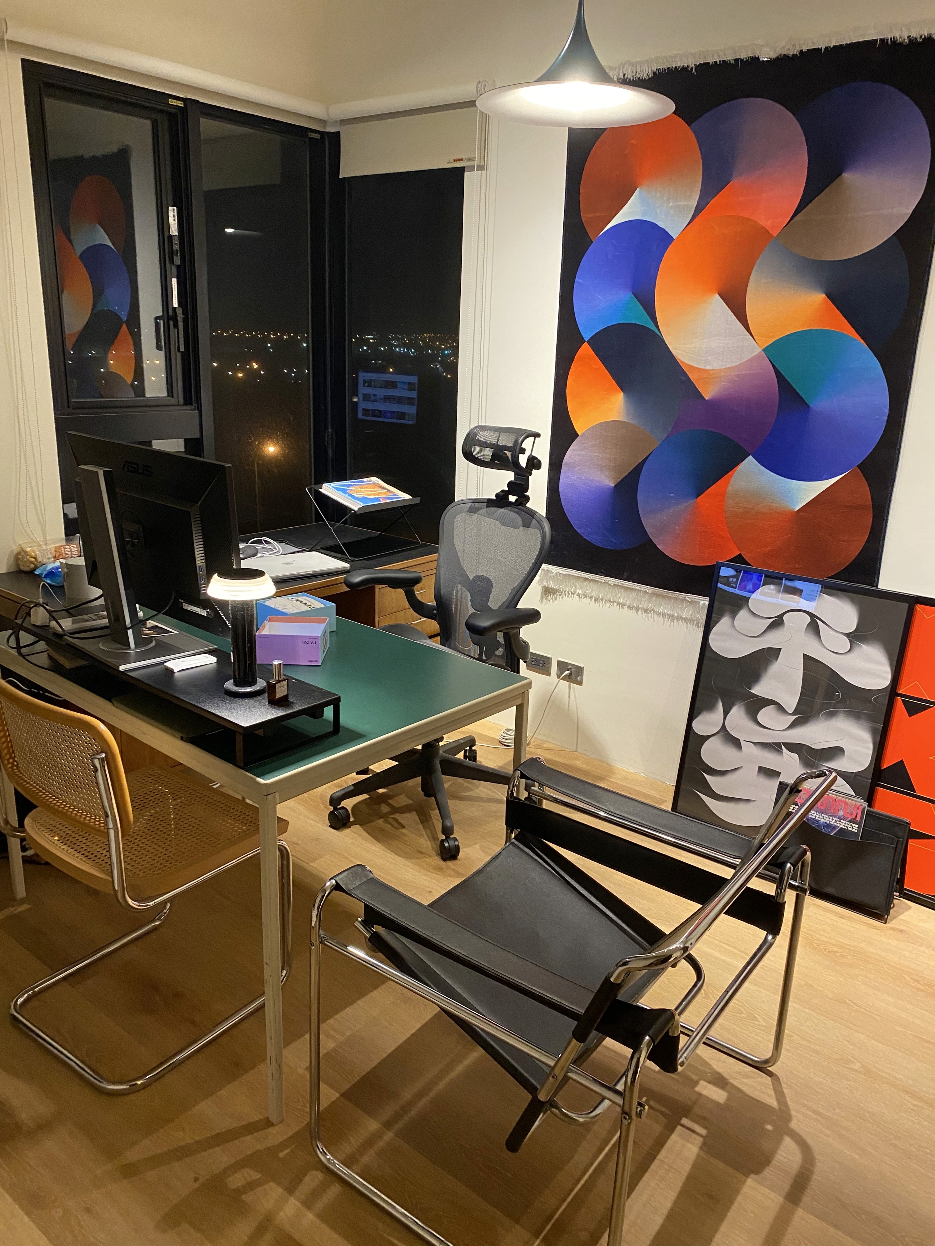
At that time, I was digitally nomadic, working between Japan and Taiwan. I enjoyed creating in Japanese cafes, appreciating the space they offered. I also cherished my workspace in Taiwan, where I spent time each day arranging it to enhance my creative mood.
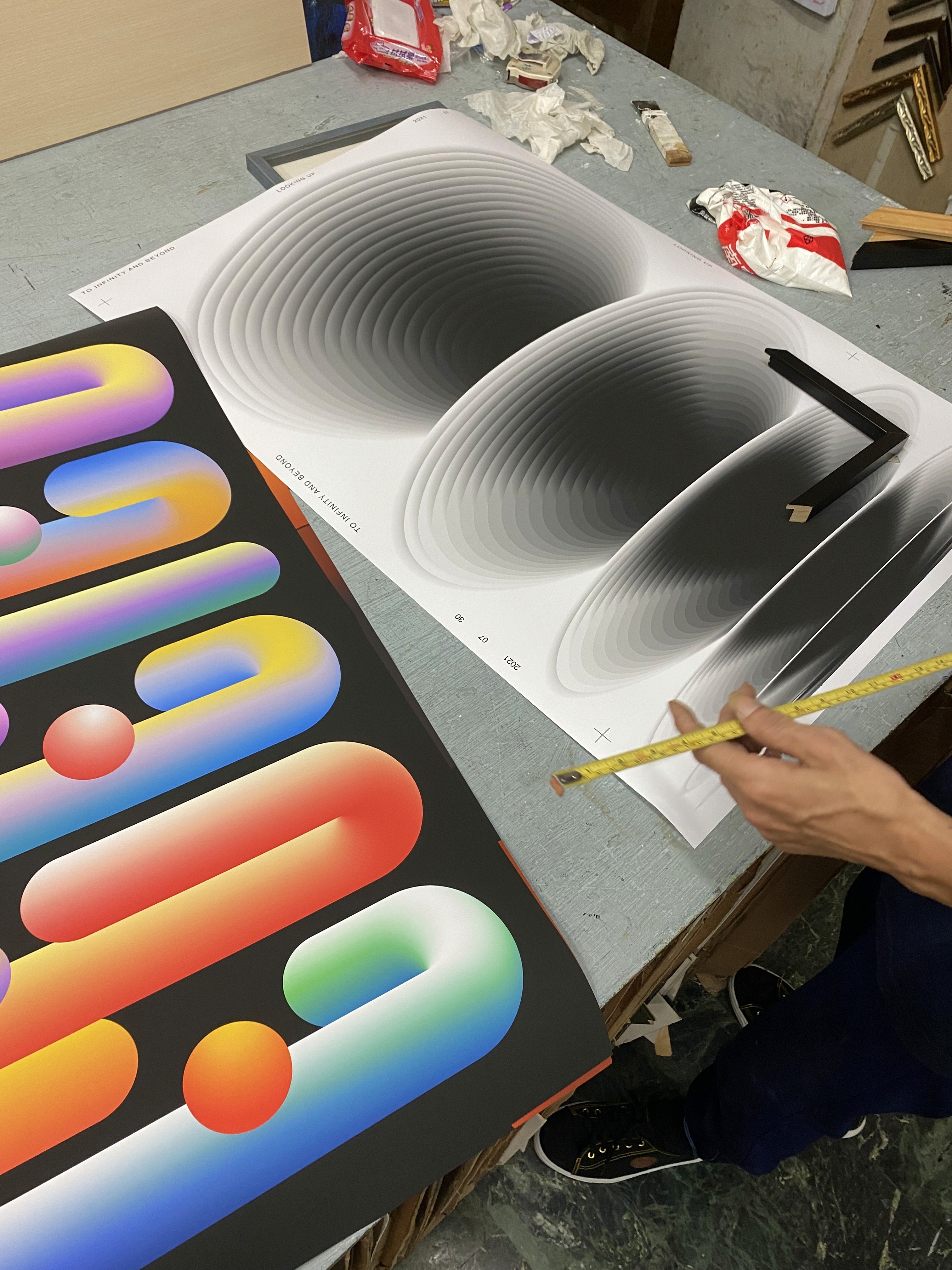
My workspace
If this project had a soundtrack, which one would it be?
Which tools did you use to create this project?
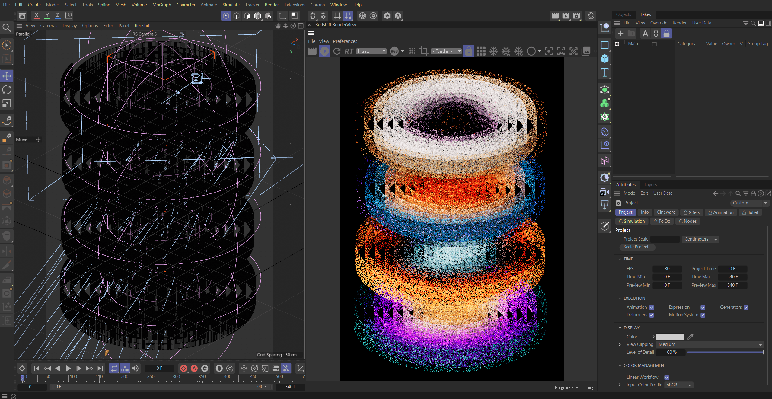
C4D
What are you currently working on, and what's next?
I'm currently experimenting with turning my creations into physical installations. In the future, I hope to organize an exhibition showcasing them.
Who or what are you inspired by lately? Any current influences that you find are seeping into your work
Still Ólafur Elíasson, his application of colors in real-world settings is remarkable.
If you could give your younger self one piece of advice about navigating the design world, what would it be?
You can skip the time for studying and start creating directly.
From the maker


