About the project
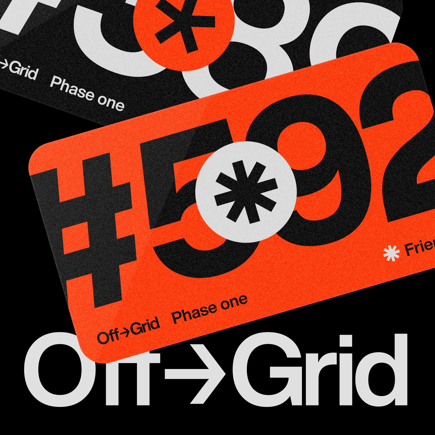
Off-Grid is a new platform dedicated to sharing in-depth design projects and insightful interviews with the brilliant minds behind them. Rather than being just another showcase for aesthetically pleasing images, our aim with Off-Grid is to dig into inspiring projects, giving deep and unique insights that add real value.


What sparked this project?
The start of Off-grid stemmed from a recognized need in the design community. We observed that while there are many platforms showcasing attractive design works, very few dive deep into the stories, challenges, and insights behind those projects. We wanted to fill that gap by not only highlighting beautiful designs but also exploring the journey and the dedicated teams behind each project.
Who was on the team for the project?
Off-Grid is the first project of APEX©, a fully remote creative collective founded by Fons Mans. The project team for Off-Grid was kept intentionally small, working with Stephanie Bruce and Nastia Osche to envision and build the first version of this platform.
Do you have some project metrics to share?
We're excited to share that even before our official launch, Off-Grid has garnered significant interest. We're nearing 11,000 followers and have an equally impressive number of subscribers to our newsletter. The enthusiasm and support from our community is overwhelming, and we're eager to see where this momentum takes us.
What is your approach to working on a project like this? Do you follow a specific process or framework?
While we don't adhere to a strict framework, we emphasize collaboration, feedback, and a commitment to diving deeper into design stories. Our approach, like many of our projects, is rooted in deep research and community engagement. We like to try and share as much as possible, to hear from our community and see which things resonates. This is also why we're launching an exclusive community today for our most engaged members.
What did the early versions of this project look like? What did you learn from this v1?
The initial iteration of Off-Grid began as a sort of blog post format. However, as we refined our approach, we transitioned into a more interactive interview style, which we found to be more engaging for our audience. Alongside, we introduced subscription models, each with its unique set of advantages. These include the "supporter," "friend," and "founder" tiers, offering features such as priority submission reviews, exclusive deals, support for our editorial team, Q&A sessions with featured designers, and special livestreams exclusive to members. This evolution taught us the importance of listening to our community and continuously innovating to enhance user engagement and experience.
'The paramount challenge was ensuring Off-grid wasn’t just another platform showcasing beautiful images.'
What was the biggest challenge? Did any part of the project make you step out of your comfort zone?
The paramount challenge was ensuring Off-grid wasn’t just another platform showcasing beautiful images. In the saturated design space, where platforms can sometimes resemble a Pinterest board, we yearned to dig deeper. It certainly pushed us out of our comfort zones, as it required a shift from the norm and a commitment to delivering richer content that truly highlighted the process and the talented teams behind each project.
How did you overcome this challenge?
We recognized that to stand out, we had to prioritize the stories, the process, and the makers behind each design. Rather than just showcasing end results, we decided to dive into the journey, discussing the highs and lows, and celebrating the teams that made it all happen. This was a significant deviation from typical design platforms, but our conviction and the invaluable feedback from the design community affirmed our direction.
What and/or who inspired you during the creation of this project?
A big inspiration for us was the (now infamous within the design community) Netflix Series 'Abstract'. In this series, the viewer gets to take a look behind the scenes in various creative fields. Even though we're launching Off-Grid in mostly written format, we aspire to deliver our stories in a documentary format in the future.
What was your biggest learning or take-away from creating this project?
Not every idea or approach we took panned out as anticipated, and often, time constraints pushed us to reimagine our strategies. However, this continuous cycle of learning, iterating, and pivoting led us to a space that not only resonated with our vision hopefully caters more effectively to our community.
Can you point out a detail in the project that might go unnoticed but you’re particularly proud of?
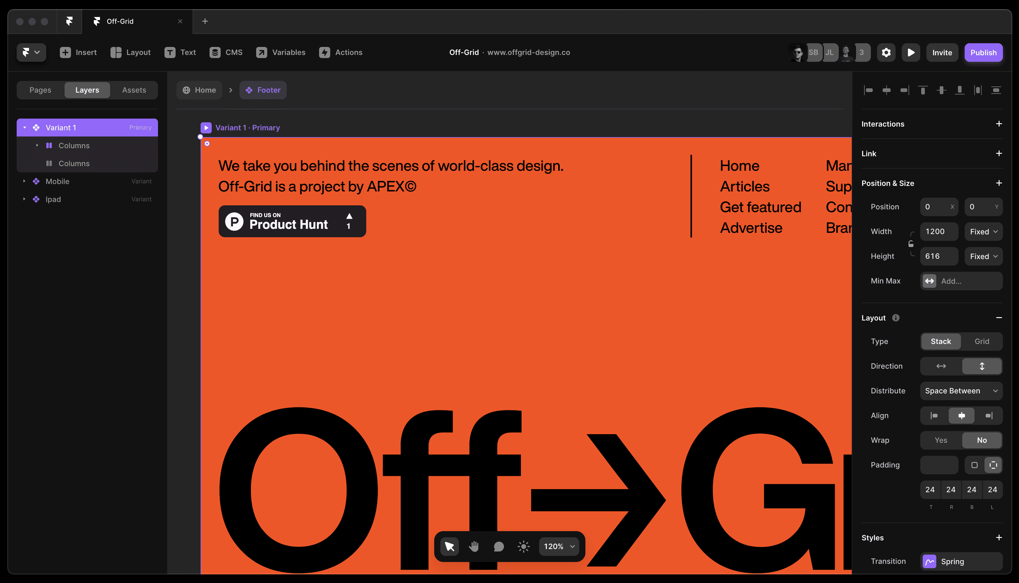
A noteworthy detail about our journey is the way we've adapted and grown with Framer, a web development tool that's both powerful and user-friendly. It played a pivotal role in shaping the website's interactive elements and overall user experience. Shifting focus to our journey with the Content Management System (CMS), while it required some adjustments to fit our vision, the effort has genuinely paid off. We've achieved a rhythm that allows us to deliver the in-depth content our community seeks. This process has been a valuable learning experience, and we're proud of the efficient system we've established from it.
'We've adapted and grown with Framer, a web development tool that's both powerful and user-friendly.'
What was the result of this project?
Even prior to our official launch, the anticipation for Off-Grid has been awesome. We've already connected with nearly 11,000 followers and subscribers, underscoring the demand for such a platform in the design community. The early success and interest have validated our vision and also hinted at new avenues for collaboration and potential projects in the future.
Where was the project created? What do you enjoy about working there?
The project was developed in our digital workspace, using a combination of innovative tools. Figma has been a cornerstone for our design decisions, allowing us to iterate and collaborate in real-time. Framer further elevated our web development, letting us realize our designs without the usual coding limitations. The harmony between these tools and our team's passion has made our workspace both efficient and fun.
If this project had a soundtrack, which one would it be?
Which tools did you use to create this project?
Framer - Web Design & Content Management
Figma - Visual & Brand Design
Loops - Newsletter editor

Building the Off-Grid site in Framer
What are you currently working on, and what's next?
After our launch, we're planning to explore various content options such as podcasts, livestreams and even documentary style video. We can't wait to expand the offering of our platform and help our members discover new creative processes that can inspire them in their own projects.
Who or what are you inspired by lately? Any current influences that you find are seeping into your work
We've been deeply inspired by the design community itself, especially the creators and teams behind various innovative projects. Platforms like Twitter have been a goldmine for us in terms of finding raw, unfiltered design narratives and insights.
If you could give your younger self one piece of advice about navigating the design world, what would it be?
Maybe it sounds cliche, or maybe you've heard it countless times, but would be 'Embrace the journey, not just the destination.' It's tempting to get swept up in the pursuit of perfection or the comparison game with peers. Every project, triumph, or hiccup is a lesson in disguise. Trust your journey, remain curious, and don't shy away from seeking guidance or mentorship.
From the maker


